First of all, I cannot believe that it is already Monday. These weekends just go by way too quickly! I also am in denial that it is going to be November this week, but I can’t wait for Halloween. Eli and Dax are going to look so cute in their costumes and even though it is going to be freezing, we will still take them trick-or-treating. Well, at least Eli will go, Dax is only 5 months old and probably shouldn’t be out in the cold weather. Anyway, let’s talk renovation progress especially since I am writing this in a house that is so unbelievably loud right now because so much is getting done. More on that later.
Last week our contractor put up some paint samples. He gave us three options, I loved one and David loved another. The problem was that David really didn’t like the one that I loved, and I really didn’t like the one that he loved and neither of us liked the third option. We absolutely loved the paint that we had throughout Compass Pointe. We used Sherwin-Williams Repose Gray and it was seriously the perfect gray. There were no undertones, just gray. I was obsessed with it, so when we were deciding what color we would do the majority of this house, we really didn’t even need to discuss it. I told our contractor that there was no need for other color samples in the bathroom, we were just going to paint everything Repose. His crew actually isn’t doing our painting because their quote was higher than David thought it should be, but they offered to paint the master bathroom because there is such little wall space, so why not? The bathroom looks amazing, I am seriously so happy with it, but the paint doesn’t look so amazing.
David and I were shocked that when we walked in, our beloved Repose looked beige, not the beautiful cool gray we remembered or looked back at in pictures. We made sure it was the right color on the can, and sure enough it is. After stewing on it during the weekend, and researching more about Repose Gray, we came to the conclusion that it looked beige because this house has the worst natural lighting ever. I can’t even tell you how dark the house is and how little windows there are. Compass Pointe was full of natural light, there were many windows and huge windows as well throughout the house, it makes sense now why Repose looked like the perfect gray there and like beige in this house.
So, we spent Sunday paint shopping. We got some colors that were recommended on multiple blogs and on Pinterest, and we headed to Sherwin-Williams and Benjamin Moore and picked up five or six paint samples. David painted the samples on many areas in almost every room, but it became a bit frustrating because every room has such different lighting that it is diccifdult to choose one color to use throughout the house. One color might look gray in our bathroom, but beige in the hall, or vice versa. Finally, we decided on the perfect colors by Benjamin Moore called Gray Owl and Gray Tint. These two are the ones that don’t seem to have any undertones regarding the light situation. I am so excited to get rid of our dark walls and to get this house brightened up, but in the meantime I can’t wait to replace the Repose in the bathroom with the Graytint. It is going to look gorgeous! Until the bathroom gets repainted, take a look at what got done last week. 
 I have a feeling I will have a couple more progress posts this week, fingers crossed!
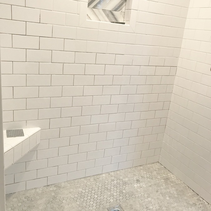
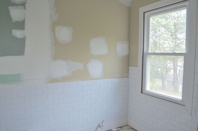
 Our shower- you can tell where they still have grouting to finish. Doesn’t it look pretty?!
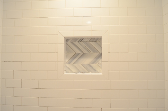


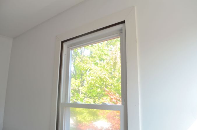
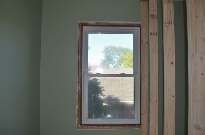
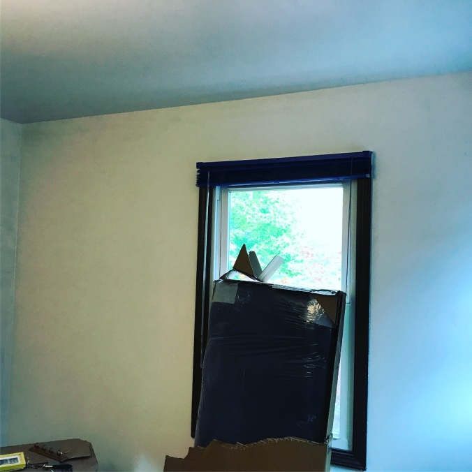
 This is the window after the closet was framed…
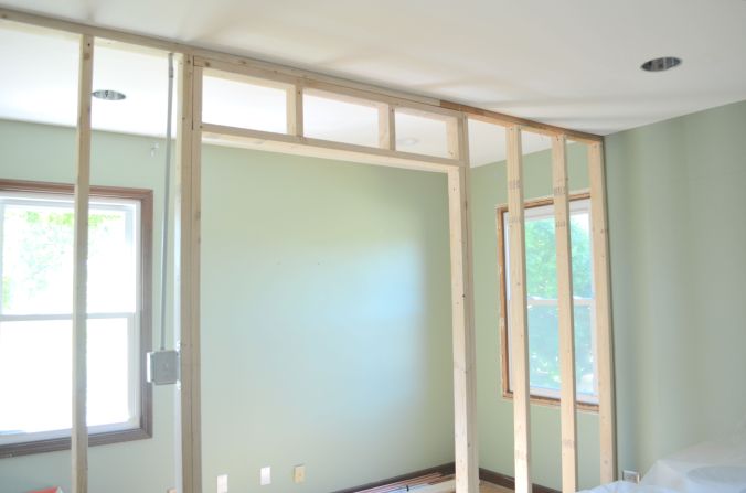 The plan was to move the window to the other side of the closet so that we have two windows in the bedroom, one on each side of our bed. We budgeted for it and were all set to go, but when the contractor went to scope out the exterior of the home, he discovered that our chimney was exactly where we wanted to move the window. We didn’t budget a bajillion dollars to basically move and rebuild an entire chimney, so unfortunately this window has to stay in the closet.
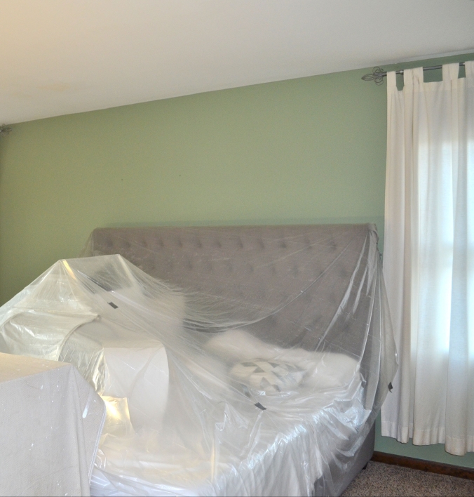 Fortunately we have some time to think about how we want to go about this, and hopefully we will have a clearer vision once the room is more complete.
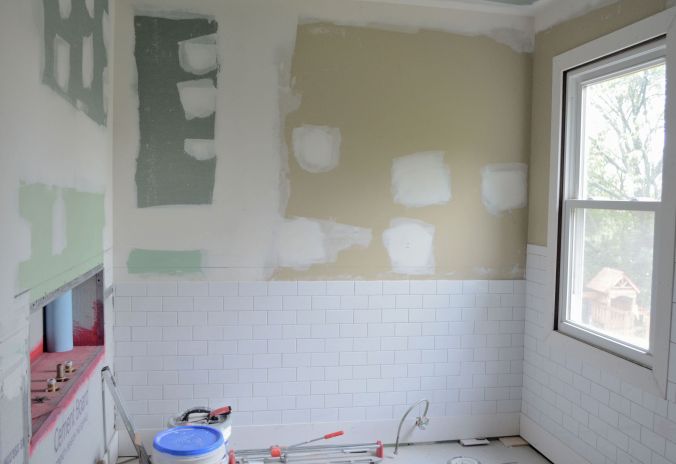
 The bathroom is looking amazing. This is a view of where the tub and toilet will be going.
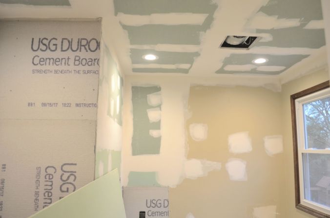 Our shower! Don’t mind the attic access. This used to be my walk in closet so it didn’t look tacky to have the attic access in there, but now that it is in the bathroom it doesn’t look right, so we are moving it to the future laundry room.
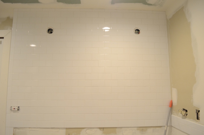
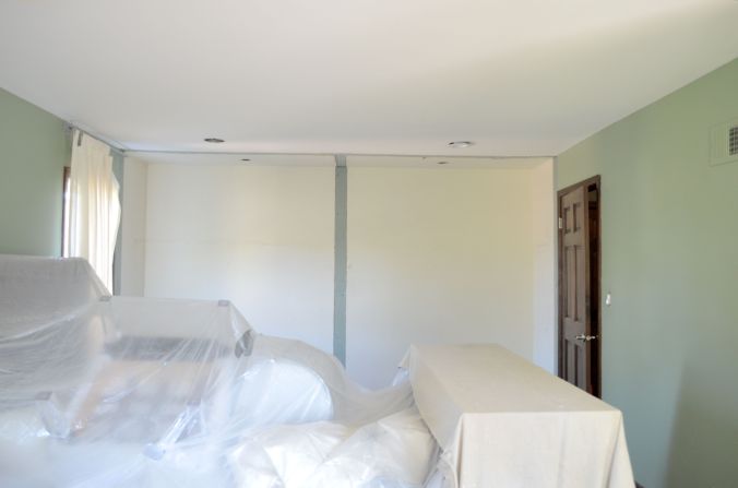
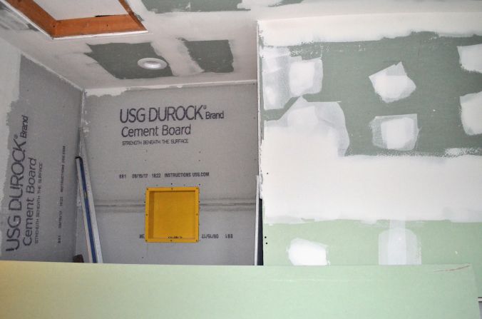 All of our wrapped up furniture was moved into the future laundry room this week because they started sanding everything. We also saw the cabinets, floor tiles, backsplash, and counter last week. The floors and cabinets will get installed this week- I can’t believe how fast it’s coming together.

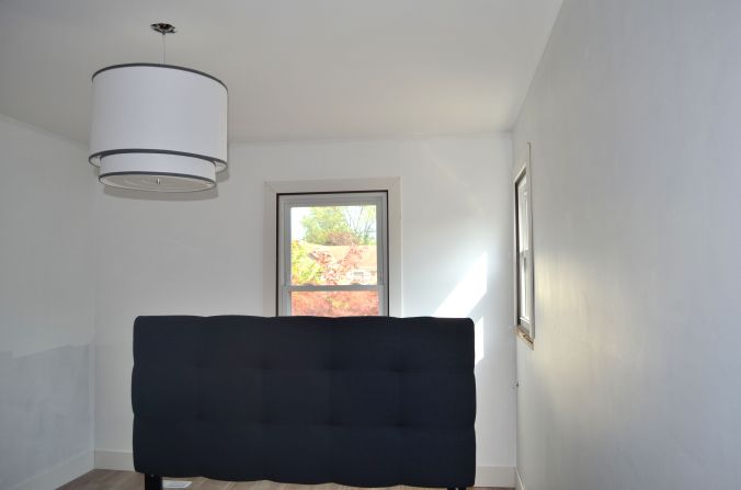
 I have yet to share the awesomeness that is Dax’s nursery but let me tell you, its freaking amazing in my opinion. We did some fabulous moldings in there that we wanted to do in Eli’s room as well. David could seriously do moldings as a side gig now, he’s done Eli’s nursery/room about 3 times now and each time he gets better and better.
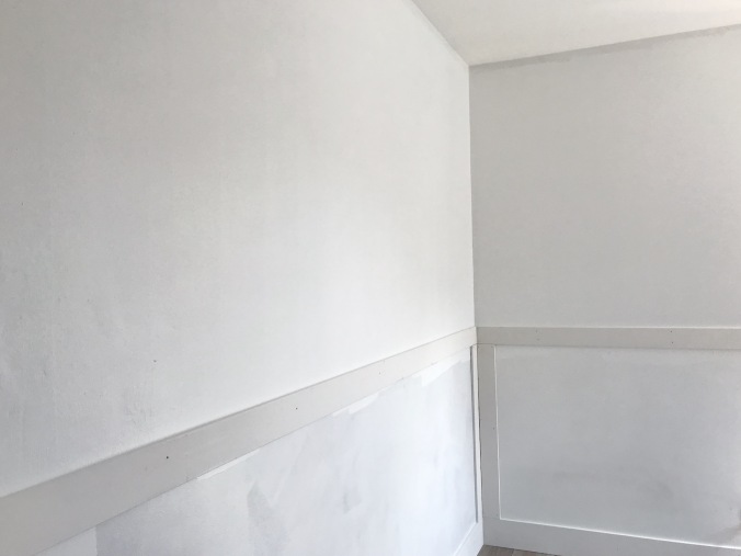


 Looks beautiful right? Once we are all moved out of Eli’s room after construction, we are going to install wallpaper on an accent wall. I seriously am so excited! Stay tuned!
 You can see there is some more canned lighting, and here my friends is our new walk in closet!
 No words can describe my excitement for the light that will be in our bathroom. We had one light, dark walls and floors, and beige/yellow tiles in the shower. It was so dark and dirty looking. Not to mention, our fan. Holy moly, the fan in that bathroom was beyond disgusting. It was so dirty that it made a creepy noise and didn’t ventilate anything in the room. Because the fan was so awful, all of our towels and my clothes in the closet smelled like mildew and mold. So lovely. David’s company carries intense fans, and when we told the contractor which kind we got he said it will literally suck up everything. I can’t wait to buy new towels and to not feel dirty and smelly after I use them!
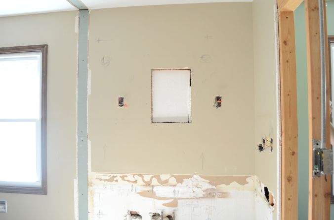
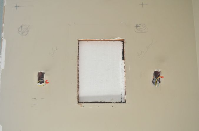 Our contractor framed the wall behind where our bathtub will be going. He inserted an area for us to store candles and bubbles and such.
 I am so impressed with our contractor and the rest of his team so far. They are so respectful of our space, honest, keeping us on budget as best as they can, and doing an amazing job! You would think I would be excited at 5:00 when David gets home, but the truth is I am more excited for the contractor to leave than for David to take the boys off of my hands because that is when I get to see the progress!!
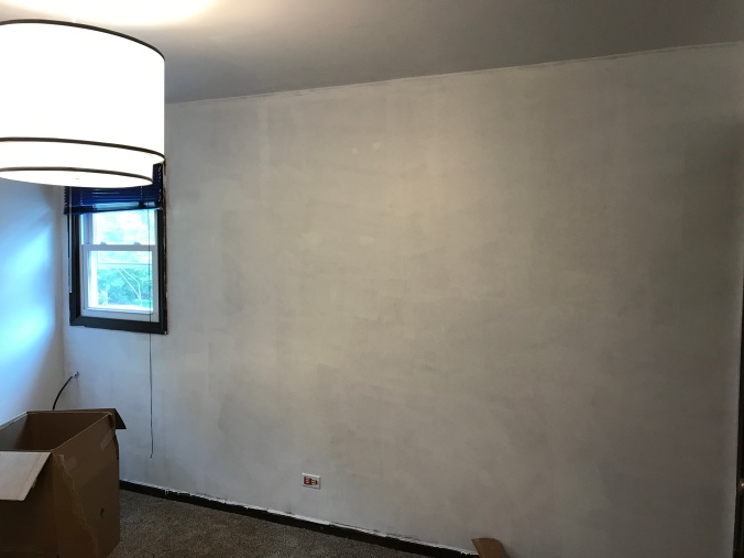

 See ya, carpet
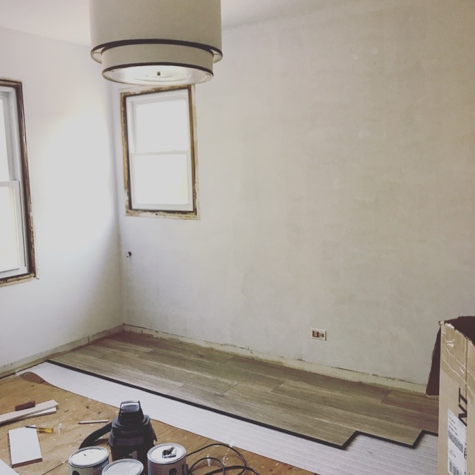
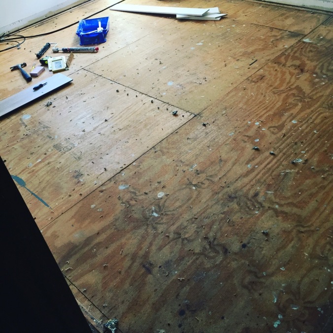 Installing the floors…the first time

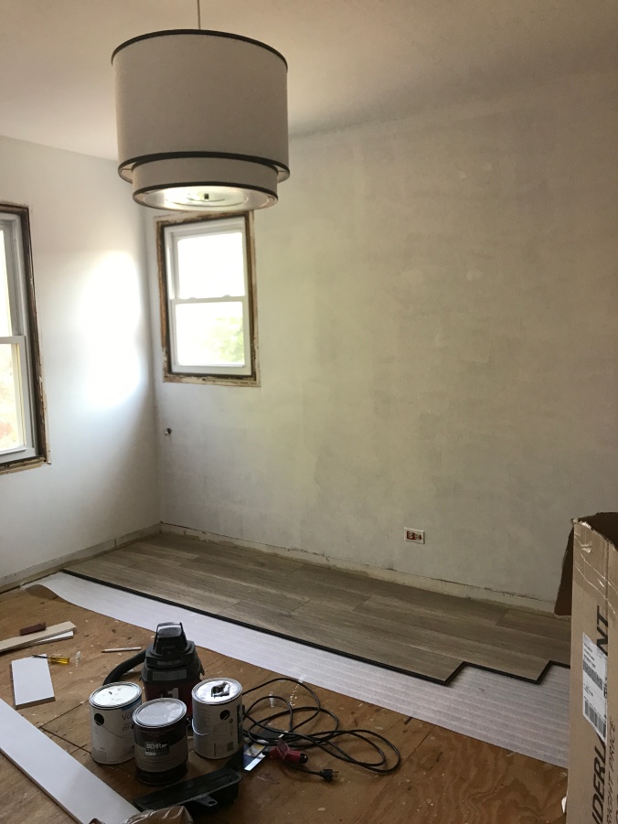
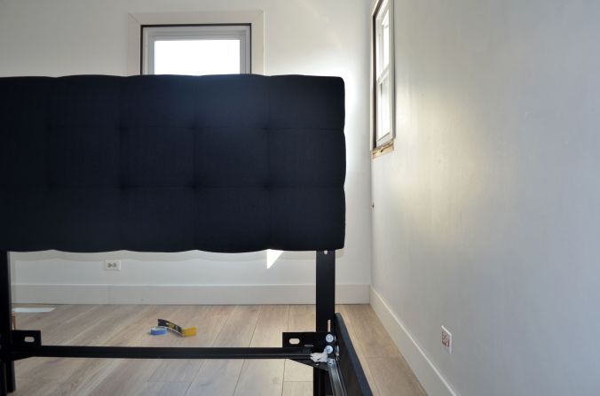
 After all of the work it took to get these floors installed, you would think I would have taken a picture of the finished product. Well, we thought it would be a good idea to build Eli’s big boy bed and it is sitting in the middle of the room, which makes it nearly impossible for me to take a picture of the floors. Don’t worry though, next up is baseboard and moldings and you will be able to get a better picture of the floors then.